App - Redesign
GasBuddy
Scroll ↓
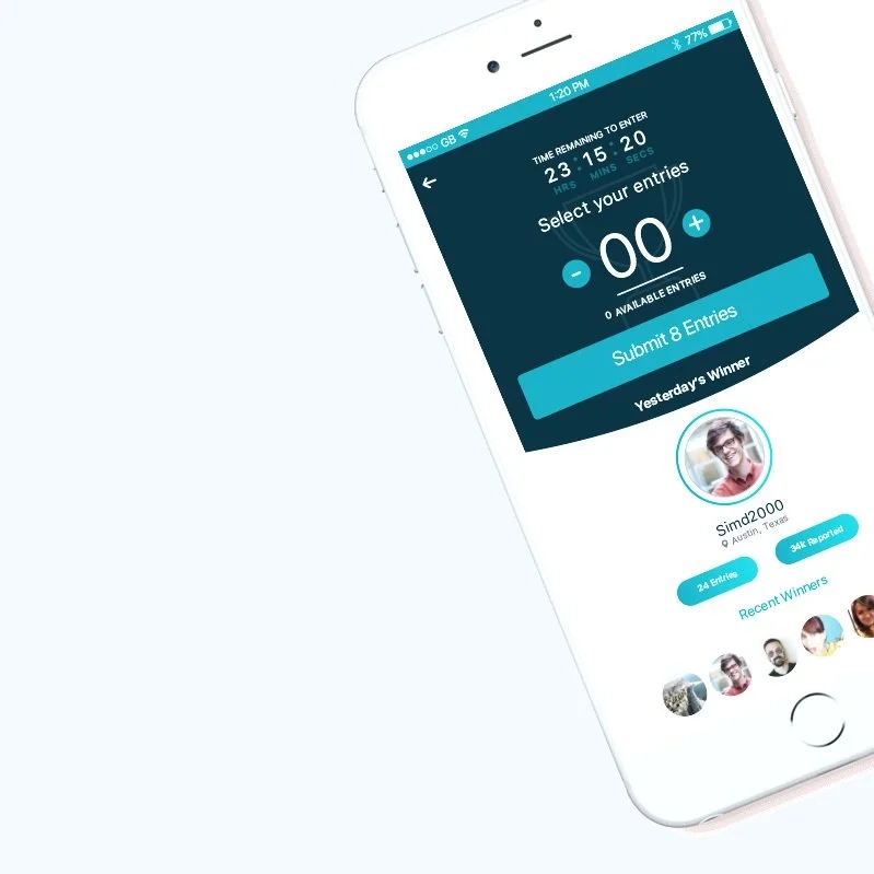
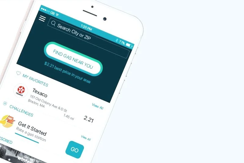
Our system as a custom guideline based somewhat on both Material and Human Interface Guidelines so or UX/UI includes a mix of actions and experiences from both. This is evident in overall design outcome, nicely integrating Material assets like Floating action buttons (FAB) and iOS linear back and forth progress with the definitive back arrow to move between screens and menus.
We also added a day/night mode function to the Android version of the GasBuddy App based on server time (calculated by estimated sun set at the users location) and user activated.
Validating Assumptions
Conclusion
After loops of feedback and weekly design critiques from the Product Design team and the development team, we learned that design treatments that are native Material Design would drive greater efficiency and create more coherent experience for users.
We continued to collaborate with teams for feedback. Validating our design solutions through user testing especially helped to become confident in our design decisions.
Overall, the user experience changes made, brought significant improvement overall, although not all of the UI design made it into release. Design and development continued to work side by side for several sprints after release to ensure the best quality of delivery and review implementation in a feedback loop that informed later sprints. Overall the team and stakeholders alike were happy with the implementation although through subsequent testing we discovered that the information architecture would have benefit from restructuring as UT highlighted some key features were buried to many layers deep within the solution.
Exploring Design Solutions
High Fidelity Concepts
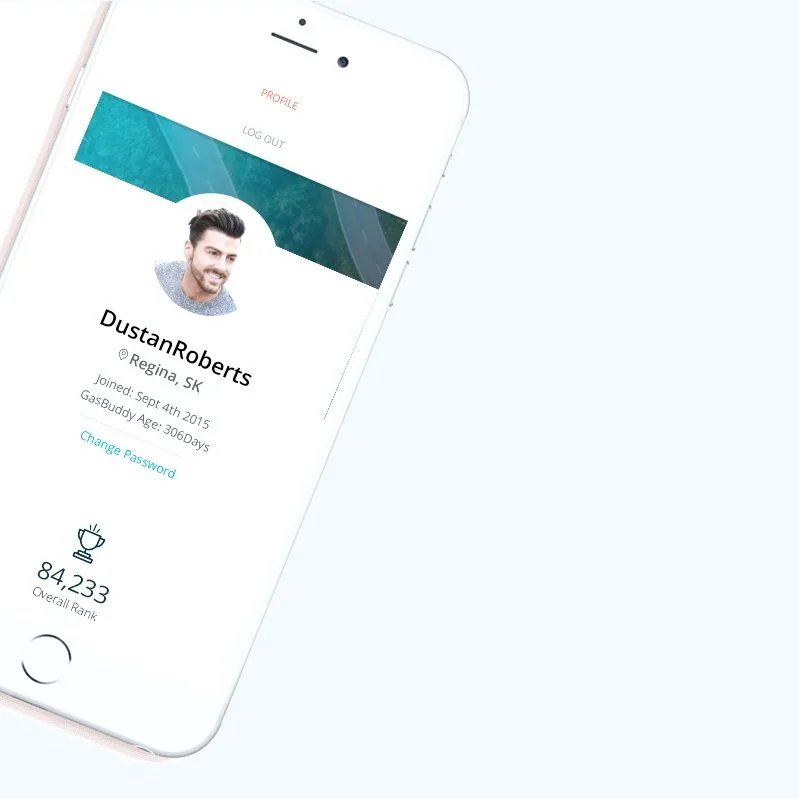
With a solid design system in place, including patterns and component libs etc… wire-frames felt unnecessary. As a result, the team began at high fidelity stage as the initial risks had been tested and weeded out at earlier stages. I began with the tackling the Menu and Home Screen with the objective of cleaning up the UI of both as prior versions were over cluttered and confusing. Historically the user profile had felt overwhelming with a huge variety of features and options that brought almost no value and lacked any call to action.
User testing (Card Sorting)
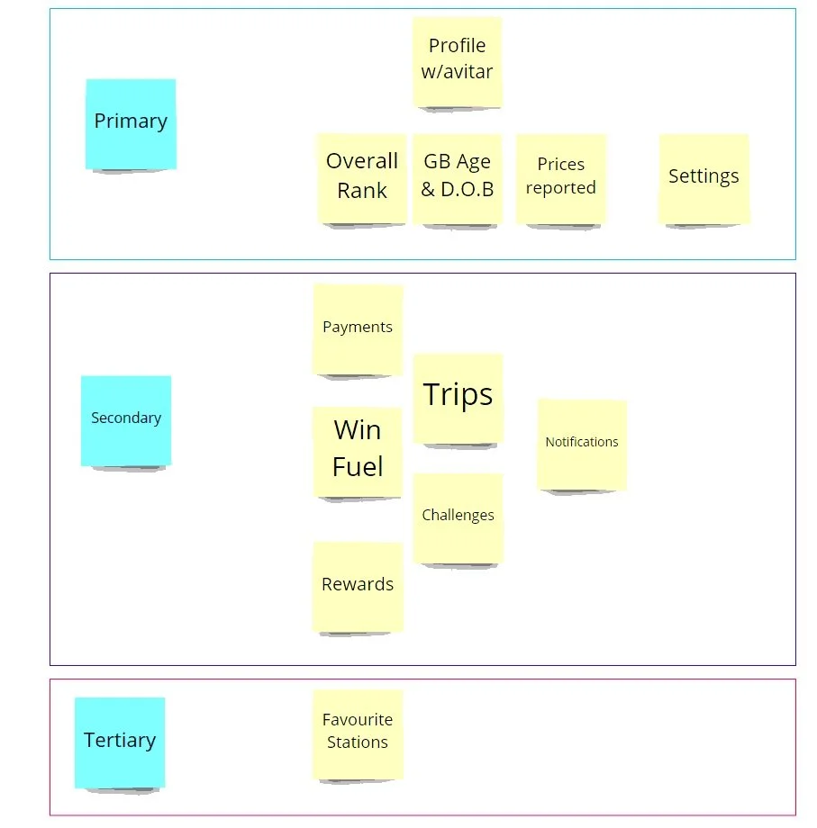
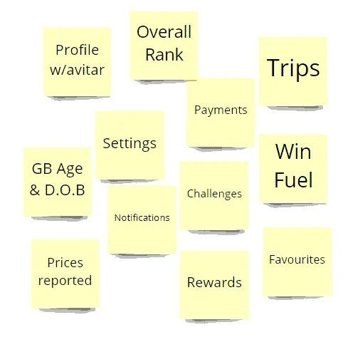
I began by categorizing actions by level of importance based on an actions potential value to the organization and the user. then began conducting a tree test with several users to identify viable placement for the features and actions.
Users were 100% on board with relocating some of our less valuable features into the menu which meant we could utilize more prominent real estate on the main screen for intergradations and partnership opportunities. This also meant that we were able to deprecate some of our outdated features in order to streamline the user experience and make way for more fruitful integrations.
Re-design
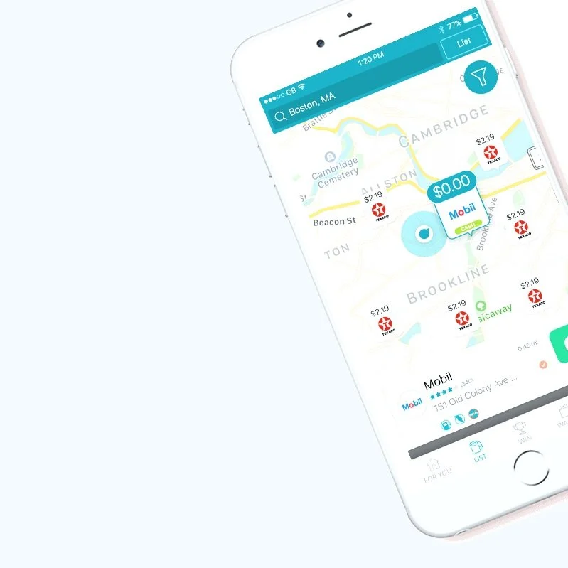
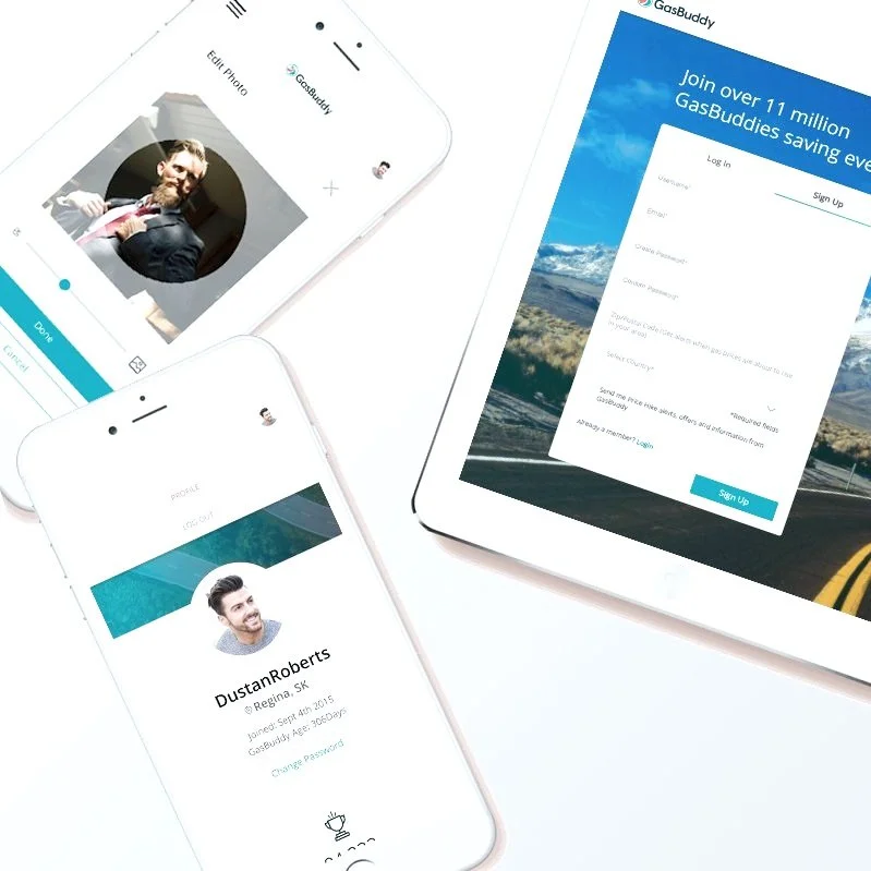
After an initial design sprint and several iterations of wires, the overall concept was created and delivered to the Product team at GasBuddy. From here I was tasked with seeing through the overall design system including, Landing pages, User profile, Map view and Primary menu actions for Android App and mobile web.
GasBuddy's mission is to make fuel savings easier and more accessible for everyone. In fact, we have helped North American drivers save more than $3 billion by providing real-time gas price information at 150,000+ stations, offering cashback rewards on purchases with brand partners, and through the Pay with GasBuddy™ payments card that offers cents-off per gallon at virtually all gas stations across the US. The GasBuddy app has been downloaded nearly 100 million times and is one of the highest-rated apps in the history of the Apple App Store.
Client
GasBuddy
Role
Web & Android UX/UI Designer
Location
Regina, Saskatchewan

